There are many font options available, however, you must first comprehend the various categories in order to decide which font is appropriate for you, your company, and your presentation. And even if numerous font categories are available (such as script or graphic), There are the two most crucial categories you need to comprehend to make wise design choices, Sans Serif and Serif.
How do Serif fonts differ from Sans Serif fonts?
Sans means “without,” whereas a serif is a decorative line or taper that is added to the beginning and/or end of the stem of a letter.
Serif fonts: Times New Roman, Garamond, Baskerville, Georgia, and Courier New.
Sans serif fonts : Arial, Helvetica, Proxima Nova, Futura, and Calibri.
What does your brand convey when using a serif font?
Going the serif path is a must if you want to achieve a traditional feel and aesthetic in your projects. As a result of their widespread use in books, newspapers, and magazines, serif fonts evoke memories of more conventional, formal, and intellectual subjects.
What does your brand say when you use a sans-serif font?
Sans serif fonts are all about discarding tradition in favour of contemporary refinement, while serif fonts are all about embracing tradition. Due to their post-modern minimalism and simplicity, sans serif fonts are thought of as more contemporary than serif fonts.
Serif and Sans Serif font evolution
Clearly, the decision between serif and sans serif fonts has a significant impact on branding.? Are businesses favouring one type of font over another?
Yes, to answer briefly.
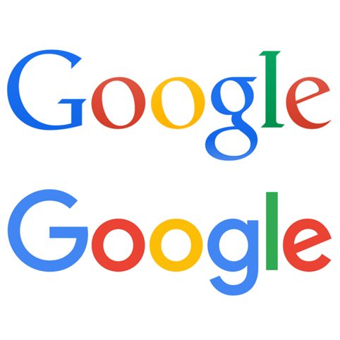
Google is one of the most well-known businesses to have adopted sans-serif typefaces.

In 2015, Google unveiled its sans-serif-based logo.
Sans versus Serif Serif typefaces: The Conclusion
The idea is to select a font that seems particularly personal to you. Serif and sans serif fonts can both be as effective.
Serifs are typically used in books and newspapers because they are quicker for the eye to read rapidly. On the other hand, applications and websites tend to favour sans-serifs in the digital space.
Serif fonts tend to be more conventional, whilst sans serif fonts feel more contemporary. So you can definitely achieve a modern aesthetic using serif fonts—or a more traditional touch with sans serif fonts—depending on how you utilize your fonts.