
Designers and business professionals would sometimes need various charts to enhance their presentations. However, it is not easy for everyone to choose the most appropriate chart. Most people are confused about what kind of chart to be deployed. Very often all categories of charts are considered before finalizing any of them which the creator is fascinated about. Many people will go for what looks good than what is appropriate.
It is critical to choose the right chart so that the presentation can deliver a specific clear message. Let us consider the following charts:
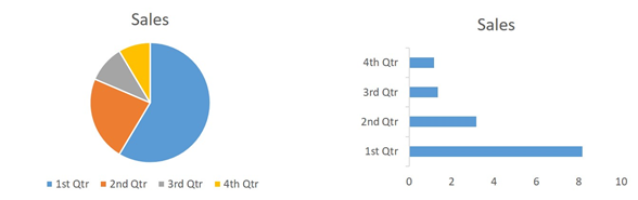
Though these charts depict the same information the messages that are actually being communicated are not the same.
If we consider the bar chart the length of each bar will naturally get compared with the other bars. Hence the chart will emphasise which is greater than the other. However, when the same information is being communicated through a pie chart, every slice is compared to the total and not to one another. Ideally, it emphasises the sales of each quarter separately as well as two or more quarters collectively.
Therefore, the message communicated in a pie chart can be: One slice alone or more than one slice collectively contributes a certain percentage of the market share.
In an ideal chart, the reader will not need to find the insight for themselves; instead, the chart will guide the readers as much as possible. Hence identifying and selecting the right chart is a must in business presentations. The wrong choice of chart even for a reason to make it look good can fail the purpose of the presentation if there is a miscommunication or possible misunderstanding due to the poor choice of charts. If this happens regularly you must appoint an effective presentation service to assist you with your presentation or you should undergo true training on this topic.
However, just to give more clarity to the fundamental ideas, let me briefly review the following popular chart types:
Bar Chart
You may use bar charts especially to compare different values. For example, compare the salary of various employees.
Colum Chart:
These kinds of charts are used to compare categories; they are especially useful to compare categories over time. For instance, compare salary hikes between years.
Pie Chart:
One can effectively use pie charts in order to compare one or more categories with the total. For instance, various religious followers among the citizens of a country, various ethnic groups living in a country etc.
Line Chart
This kind of graphical representation is excellent in depicting changes that are not reversing after each time period. For example, employee numbers for different years.
Scatter Plot
One can apply this kind of chart to show the correlation between two variable items. For instance, employees with higher salaries mostly pay higher mortgage EMI.